 Written by
  Perhaps the single greatest mistake that investors make is the idea that trading is a purely technical practice, one driven exclusively by the logic of numbers. But the truth is that traders work on emotion just as often as they work on rationale. In fact, as Warren Buffet is known for noting, much of the market is driven by a balance of fear and greed. This raises the question of whether there are even ways that could help gauge this emotion in the first place. The Japanese candlestick chart is an example of one such tool. It attempts to measure that emotion and help investors understand it. Here’s what you need to know to use it and make better investing decisions.
What Is a Candlestick Chart?
The candlestick chart portrays two of the major forces that affect the prices of assets in a market: the balance of supply and demand, and the emotional balance of fear and greed.
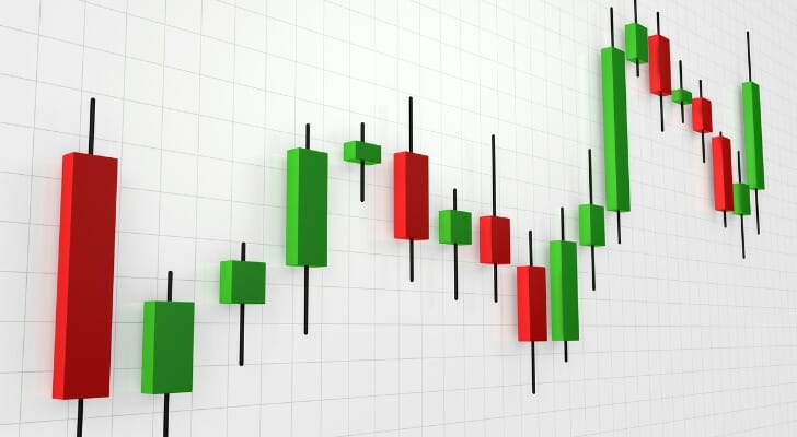
A candlestick chart tracks an asset’s movement over time. A single entry (a “candlestick”) has a line (the “shadow”) with a bar (the “real body”) in the middle. The information comes in five parts:
- The asset’s high price for the day (the shadow above the real body)
- The asset’s low price for the day (the shadow below the real body)
- The asset’s opening price for the day (either at the top or bottom of the real body)
- The asset’s closing price for the day (either at the top or bottom of the real body)
- The color of the real body color indicates a bearish or bullish trading day. Typically on a bearish candlestick, one for which the asset closed lower than it opened, the real body will be red or black. On a bullish candlestick the real body will be green or white.
On a standard chart, each candlestick covers a single day.
How to Use a Candlestick Chart
The candlestick chart was developed in the 18th century by Munehisa Homma, a Japanese rice trader who wanted to capture the degree to which emotions influenced his market as much as simple supply and demand did. He invented this format to visualize the movement of prices as well as how other traders were reacting to the market. Reading a candlestick chart is first about noticing the space between information.
The section of the shadow below the real body is known as the tail. On a bearish candlestick (one in which the asset closes lower than it opened) the tail shows the distance between the asset’s low point and its close. On a bullish candlestick (one in which the asset closes higher than it opened) the tail shows the distance between the asset’s low point and its opening.
The section of the shadow above the real body is known as the wick. On a bearish candlestick, this section tells you how far the asset rose above its opening price before eventually falling. On a bullish candlestick, it tells you how much the asset fell from its high before closing at a profit.
There is some range to this terminology. Some traders, for example, will refer to the entire shadow as the “wick” or will call the real body “the candlestick.” Pay close attention to the wording used in any given analysis on this subject to avoid confusion.
Emotions in a Candlestick Chart
A candlestick chart is designed to show the balance between buyers and sellers on a given day. Here are the three things to keep in mind that it can measure.
Volatility
The real body of the chart shows you where most of the day’s trading took place. A larger real body tends to indicate a higher volume of trading, essentially that this was a busier day for the asset. However, it also tends to indicate certainty. The more the market traded toward a price, the more likely it is that this represents a shift in value.
A small real body tends to indicate relatively little activity. It also tends to indicate indecision. In other words, traders could not settle on a direction for this price to move. This is especially true when the small real body is accompanied by a long shadow, showing extensive negotiation but relatively little outcome.
A larger shadow shows that the trading took place over a greater range of prices. This shows greater disagreement about the asset’s market price, which indicates potential volatility in the asset. Smaller shadows, by contrast, show that the market has largely settled on the price range for this asset (for that day’s trading, at least), which generally indicates lower volatility.
Seller Power
The distance between the closing price and the top of the wick indicates how much power sellers had during trading that day. A small gap indicates more power for the seller. They were able to close the price of the asset close to its highest point of trading. A wide gap indicates less power for the seller. While they may have driven up the price of the asset, they could not keep it there.
Buyer Power
The distance between the closing price and the bottom of the tail indicates how much power buyers had during trading that day. A small gap indicates greater buyer power. They were able to close the price of the asset close to its lowest point of trading. A wider gap indicates less buyer power. They could not keep the price low and eventually closed the asset closer to its high point.
Candlestick Charts vs. Bar Charts

A candlestick chart presents identical information to a bar chart. The only difference is the format. The real body of a candlestick chart presents an asset’s opening and closing more dramatically than the tick marks on a bar chart do. Some traders prefer the presentation of a candlestick chart, while others prefer the subtlety of a bar chart.
The Bottom Line
A Japanese candlestick chart is used for technical analysis and is a good way to get a sense of how the market is moving. It measures investors’ emotions and helps investors understand them. It shows how an asset has traded over the course of a day so that you can see at a glance whether investors are flocking or fleeing.
Tips for Investing
- Don’t try to read these things alone. With the right financial advisor, even the densest financial reports will make sense for you. Finding a financial advisor doesn’t have to be hard. SmartAsset’s matching tool matches you with up to three vetted financial advisors who serve your area, and you can interview your advisor matches at no cost to decide which one is right for you. If you’re ready to find an advisor who can help you achieve your financial goals, get started now.
- A variety of tools. A candlestick chart might have the weight of history behind it, but that doesn’t mean it’s the only tool out there. You can never have too much information. In our article on market profiles, you can learn about yet another set of tools to evaluate the state of the market.
Photo credit: ©iStock.com/Ong-ad Nuseewor, ©iStock.com/remco86, ©iStock.com/Viktoriia Hnatiuk