 Written by
  Edited by
Starting your journey as a new investor can feel overwhelming, especially when faced with the need to learn certain foundational skills. One key skill worth mastering is reading stock charts. These charts provide a snapshot of a stock’s performance at any given moment, offering valuable insights. At first glance, stock charts might appear complex, but learning to interpret them can guide you in selecting stocks that align with your investment goals. Gaining a solid understanding of stock charts not only aids in decision-making, but also helps demystify the often confusing language and jargon of stock trading.
Besides understanding stock charts, there are other analytical tools you could use, as well. A financial advisor can help you find and benefit from these valuable resources.
What Is a Stock Chart?
A stock chart is a graph that illustrates a stock’s movements over time. Specifically, stock charts show you how a stock’s price has increased or decreased.
Stock charts are time-bound, meaning they can offer you a look at how a stock has performed at specific moments in time. It’s common for stock charts to be broken down into these increments to show pricing movements:
- 1-day
- 5-day
- 1 month
- 6 months
- Year to date (YTD)
- 1 year
- 5 years
- Max
The max date range shows you a stock’s entire pricing history since the date it was first offered for trading on a public stock exchange. Looking at the max pricing range can be helpful if you want to see how a stock’s price has trended over its entire lifespan.
What’s Included in a Stock Chart?
Stock charts show you a stock’s price movements, for starters. But there are other things that can be included in a stock chart that can tell you more about the stock in question. This is where it’s helpful to understand some terms that are commonly associated with stock charts, including:
- Open. This is a stock’s initial price at the start of the trading day.
- Previous close. This is the stock the priced closed at for the preceding trading day.
- High. The high represents a stock’s highest trading price for the day.
- Low. The low is a stock’s lowest trading price for the day.
- 52-week high and low. The 52-week high and low are a stock’s highest and lowest prices for the most recent 52-week period.
- Volume. Volume is a measure of the number of shares of a stock that are being traded.
- Moving average. A moving average represents the average price a stock trades at over a set period of time.
- Market cap. Short for market capitalization, the market cap is a measure of a company’s valuation based on the number of shares it has outstanding and the individual price of each share.
- Price to earnings (PE) ratio. Price-to-earnings ratio is another measure of value that’s based on its share price, relative to earnings per share.
- Dividend yield. If a stock pays dividends, its stock chart will include the dividend yield, which measures dividend payouts as a percentage of the share price.
Types of Stock Charts
Stocks charts are visual tools that represent trading activity during a specific period, whether it’s five minutes, 30 minutes, one day or another interval. As we discussed above, each trading period typically includes data points such as opening, high, low and closing prices. Traders often use three of the most common chart types — line, bar and candlestick — to analyze market trends and make informed decisions.
Line Chart
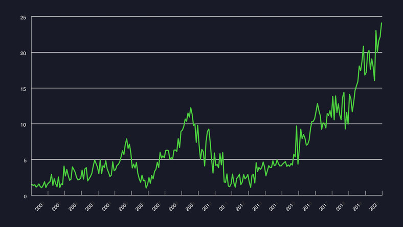
The line chart is the simplest type of price chart, connecting all closing prices of a stock with a single line over a given time period.
- Key Features:
- Provides a clear visual of trends by focusing solely on closing prices.
- Ideal for comparing closing prices from one period to the next.
- Advantages:
- Easy to interpret for spotting long-term trends.
- Useful for aligning stock performance with broader market trends without being distracted by intraday price fluctuations.
While limited in detail, the line chart remains valuable for traders who prioritize closing prices over daily price movements.
Bar Chart
A bar chart provides a more detailed view of price activity, showing the full price range within each period.
- Key Features:
- Each bar represents the high and low prices for a specific period.
- Horizontal lines on the bar indicate the opening (left) and closing (right) prices.
- Advantages:
- Helps traders visualize price volatility, as bars expand and contract with market activity.
- Allows for the analysis of trends during periods of high or low volatility.
The bar chart’s structure makes it ideal for observing price fluctuations and identifying potential trading opportunities based on market momentum.
Candlestick Chart
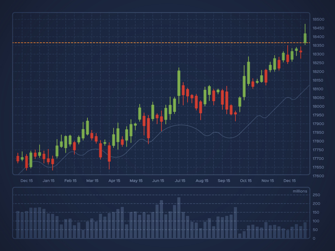
A candlestick chart builds on the bar chart by providing additional insights into market sentiment through its unique design.
- Key Features:
- The “body” represents the range between the opening and closing prices.
- Green candles signify a closing price higher than the opening, while red candles indicate a lower closing price.
- The “wick” or “shadow” reflects the period’s high and low prices.
- Advantages:
- Highlights bullish and bearish market trends more effectively.
- Reveals patterns that traders can use as entry or exit signals.
In trending markets, candlestick clusters often indicate momentum, with green candles dominating in bull markets and red candles more prevalent in bear markets. Specific candlestick patterns can signal reversals, continuations or key market entry points.
How to Read Stock Charts
The first step in reading a stock chart is familiarizing yourself with each of the terms mentioned above. Depending on where you’re reading the chart, the information may be organized differently. So it helps to get your bearings first. From there, you can move on to the more advanced stage of stock chart reading, which involves looking for trading patterns.
You can start by identifying the trend line. The trend line on a stock chart is simply a line that connects one price point to another. This line will tell you whether a stock is moving up or down on a given day and how its price has changed over longer periods of time.
Next, you can look at the volume to determine how much trading activity is taking place around a particular stock. Looking at volume and pricing trendlines together can help you understand investor behavior and trends for a stock. Declining prices and increasing volume, for example, could signal a wave of panic-selling. Declining prices and lower volume, on other hand, might suggest that investors are holding onto shares in expectation of a price rebound.
Drawing lines of resistance and support can also offer insight into how investors perceive a particular stock and how that can affect pricing and trading volume. A line of resistance measures a price range that a stock is not likely to move above while a line of support measures a price range that a stock is not likely to move below.
Where you set these lines can depend on how long you plan to hold a stock, your risk tolerance and goals. But the purpose of using these lines to identify trends in pricing highs and lows. This can help you decide on the right timing to buy or sell a stock, based on which way you think the price will move next.
You can also look at moving averages to gauge pricing trends and levels of support among investors. By looking at volume and pricing around key moving average points, like the 50-day, 100-day or 200-day marks, you can see whether investors are buying more of a stock, selling it off or simply holding steady.
Bottom Line

Stock charts can tell you quite a bit about a stock and its pricing trends over various time periods. They can also tell you how the market as a whole perceives a particular stock and how that’s reflected in trading activity. Keep in mind that knowing how to read stock charts is not essential to building a portfolio and creating wealth over the long term. But it can help you make more informed decisions when it comes to buying and selling stocks.
Tips for Investing
- Consider talking to a financial advisor about how to read stock charts and how to use them to guide your investment decisions. If you don’t have a financial advisor yet, finding one doesn’t have to be difficult. SmartAsset’s financial advisor matching tool can help you connect with professional advisors in your local area. It takes just a few minutes to get your personalized advisor recommendations online. If you’re ready, get started now.
- If your investments pay off, you may owe the capital gains tax. Figure out how much you’ll pay when you sell your stocks with our capital gains tax calculator.
- Stock charts can be found online and many online brokerages make them available to traders. If you’re planning to open a new brokerage account, consider the range of stock charts and analysis tools offered. Also, pay attention to the fees you’ll pay to invest. More brokerages are offering commission-free trading for U.S. stocks and exchange-traded funds (ETFs) but some still charge trading fees. So consider how much you’ll pay to buy and sell shares, as that can affect your overall return profile.
Photo credit: ©iStock.com/MicroStockHub, ©iStock.com/v-graphix, ©iStock.com/filo, ©iStock.com/eclipse_images